Tuesday, April 7, 2009

Opus Week 10

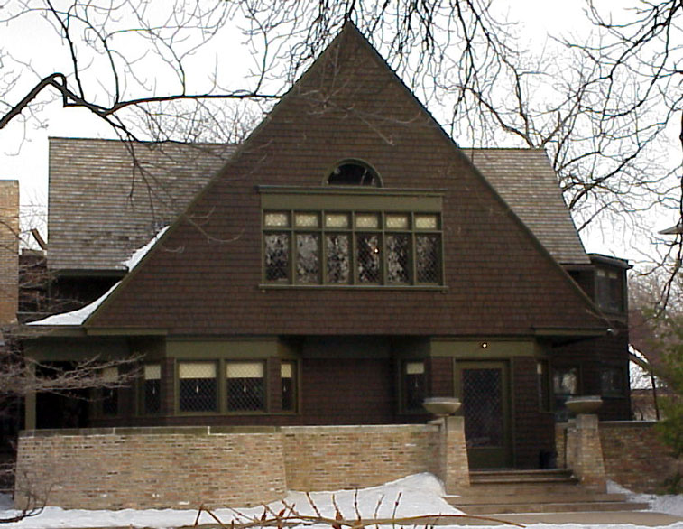
Frank Lloyd Wright's home and studio is a beautiful example of the Arts and Crafts style.

Craft defines a design that is made with skill and dexterity. The Aesthetic movement, Arts and Crafts, and the English Free Architecture movement focused on excellent handmade craft, particularly in woodwork and textile designs. Designs such as the beautiful arts and crafts interior of the Gamble House by Greene and Greene represent excellent craft in that each piece was made with care (Massey 22). Homes today exhibit the worst kind of craft in order to build them quickly and cheaply. The Arts and Crafts style is not cheap, especially if the design is completely handmade as William Morris advocated for throughout his lifetime. Many designers throughout the Arts and Crafts movement and it's various 'sister' movements incorporated both handmade and machine made elements. Morris's ideals were just that, ideals, and many realized that machines were not the enemy. What the design movements of the 19th and early 20th century focused on was detailed designs made with thought and craft.


An interior view of Falling Water by Frank Lloyd Wright.


The separation between public and private spaces became less defined in the beginning of the 20th century with the work of Frank Lloyd Wright and the modern movement. Frank Lloyd Wright searched for his own style as well as an American style in his work which reflects the arts and crafts style. Wright worked under Louis Sullivan and took much of his inspiration from the work he did with Sullivan and his firm. Wright came into his own however and developed a very recognizable style of his own that went far beyond the original 'Chicago-school' style of architecture. Wrights work was inspired by nature and integrated the outdoors into the interior through large windows and stone and natural materials. Through this outdoor/indoor design, Wright chose not to follow traditional home designs where living areas are specifically designed. His floor plans such as those at Falling Water have no defining walls, simply a few load bearing walls and columns (Massey 84).

The Holocaust Memorial in Berlin

Design is a visual language. It can tell a story and evoke feelings without words as art does. Two similar examples which were designed to evoke very strong emotions in the people who walked through the spaces are the Holocaust Memorial in Berlin and The Holocaust Museum in the United States. The Holocaust Museum in the US exhibits dark feelings of fear and gives the viewer the experience of being in the holocaust itself. Small doorways, sharp angles, and the use of concrete tell the viewer how cold and hard life must have been like living in the camps of the Holocaust. The use of concrete and many sharp rectangular prisms of all different sizes describes the Holocaust Memorial in Berlin. It is a "Memorial to the Murdered Jews of Europe" designed by Peter Eisenman. The space is very abstract and one experiences the space through it's design language. Personally I see the many blocks as representing the coffins of each individual affected by the Holocaust. It is difficult to navigate freely through the space since the blocks are presented in grid form. Some choose to walk on top of the blocks while others weave throughout the rows. The blocks are thick and heavy which represent the weight of the deaths on the German people and all those involved (http://www.holocaust-mahnmal.de/en).
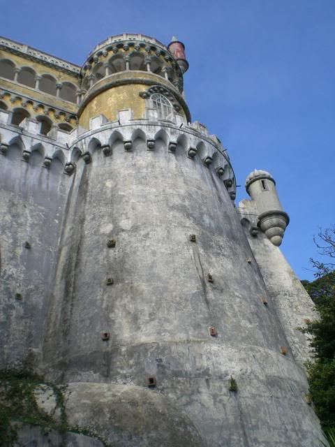
Antoni Gaudi was inspired by the techniques used by Moorish architects.

Architectural techniques are passed down to each generation. Techniques that have consistently been followed throughout time are those first developed in classical Greece and Rome. Columns and decoration inspired by classical designs some of the most popular techniques in architecture alone. Arrangement of spaces has even translated from ancient times into modern architecture. The Baths of Caracalla and their arrangement of large public space inspired Pennsylvania Station in NYC by McKim, Mead, & White (Roth 505). Spanish architect Antoni Gaudi developed his famous style through inspiration from techniques of the Moors such as the 'molded forms based on curved structural walls' (Roth 511).

An early image of UNCG's Quad. Are these buildings bringing the campus historic character or simply using too much energy and not providing enough housing for our growing campus.
Virtual renderings can be very helpful because they are detailed and precise. Although many argue that they lack character and that is why students must learn different drawing techniques. The comparison between virtual and hand-crafted harkens back to the argument between handmade and machine-made designs. One finds character in hand-made and historic designs. A local issue right here at UNCG is whether or not we should demolish the historic 1920's dormatories in the quad. There is a great need for more student housing and these dorms are using more energy and space then they need to be. Demolishing these buildings would be unsustainable and would take away the architectural character these buildings bring to the university. The dorms in the quad remind the students that UNCG is a historic school. UNCG started as a school for women and now sororities mainly live in the quad, making the quad a historic home for women students. The other issue is that the dorms are not sustainable as they are and UNCG needs more dorms. Building a new dorm in a new area means cutting down trees and interfering with the environment as well, so each option will be unsustainable, we really must find the lesser of the evils.
Virtual renderings such as the one above show a great amount of detail, yet I think that hand drawn renderings provide much more character and a designer is able to express their concept through stylistic techniques rather than computer animation that is the same for every rendering.

Craft and techniques help to create a space that is narrated through a specific design language. The 20th century gave way to the development of space planning and modernism. Whithin the latter sphere of the 20th century and the beginning of the 21st we saw design become a virtual experience. Many argue that these virtual techniques, although precise, are not as personable as handcrafted renderings are. Just as handcrafted is often preferred by many, so are older buildings compared to brand new buildings. As designers we struggle between following the past and creating new forms for the future and how we build these forms can be just as important.

The New World Trade Center


I don't usually post blogs unless I have an assignment but after researching the Manhattan Municipal Building for my precedent analysis project I was curious about the new world trade center building. I was reading an article about the Municipal Building saying that it might be turned into apartments and its offices such as the department of marriages and city hall would be moved to tower 4 of the new World Trade Center. Apparently there are going to be 4 towers to the new World Trade Center. The design was unveiled three years ago! I feel so out of the loop.

Freedom Tower is the original tower planned for the site and is supposedly going to be the tallest building in the world according to it's architects Skidmore, Owings and Merril (SOM). Three more towers were then added to the site designed by Norman Foster, Richard Rogers, Fumihiko Maki. The order of the towers are from left to right as follows: SOM tower 1, Foster tower 2, Rogers tower 3, and Maki tower 4. The designs are breathtaking and I am very excited to see how this grand center of architecture comes about. Of course each building has the safest building technology available such as separate staircases for firefighters in case of an emergency. I think I will let these designs speak for themselves!

Right: Richard Roger's tower 3 design

Wednesday, April 1, 2009

Opus Week 9

The Peacock Room in London

The culture and art of the east was illuminated to the western world when trade routes were opened up in the 1800s. Westerners loved eastern art and a flood of eastern inspired designs washed over cities such as London. The Peacock Room in London is an example of eastern inspired design in a western context. The man the room was designed worked in the Shipping industry and was obviously involved in trade, so it was only appropriate that his decor reflect his work (Massey).

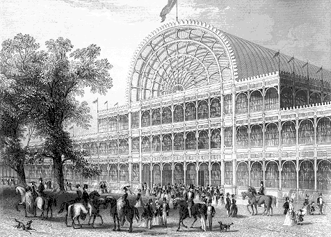
Crystal Palace

New
sources of materials and technologies rotated the direction of architecture completely. The 19th century saw the introduction of glass and metal into structures starting with the Crystal Palace. An expo showing the newest technologies of machines from around the world were shown off in the new machine-like technology of the glass and metal structure of the Crystal Palace (Roth).


Stained glass from Tassel House.

Floorplan of the main stairway in Tassel House showing the iron work and curvilinear details

Metalwork soon went from representing the straight geometric angles of machines to the curving organic qualities of the art nouveau movement. Movement and fluidity were beautifully captured in the metal work of such designs as the Tassel House designed by Victor Horta. One could say that art nouvaeu used the same sources of materials such as metal and glass and revised the male-like machine form of design into a colorful feminine form. Irony can be seen in art nouveau in that organic and human forms were recreated with industrial materials. (Massey)
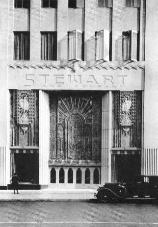
The Stewart Building in NY now demolished.

While new design movements such as the arts and crafts and art nouvaeu were taking over the design world, buildings of the nineteenth century were still
reflecting back on the past. The Stewart Building in New York, now demolished, is an example of a 19th century building with elements of the renaissance pasted on the front facade. The building employed art neavou elements along with the renaissance designs. The building is an early skyscraper/office building. If the building wasn't so hard to find information on I would have done my precedent analysis on it. In the library on campus there are a few very large books with plans of such buildings as The Stewart Building and that is where I first discovered it.

This week we've seen that architects were not fully branching out from the past and were still able to reflect upon ideas of the renaissance while they developed their work in art nouveu and the aesthetic movement. New trade routes and the very beginning of new technologies showed the beginnings of a new direction for architecture which would be later fulfilled in the 20th century.

Wednesday, March 25, 2009

Alternatives Unit Summary


The Ecstasy of St. Theresa by Bernini

Design movements tend to repeat themselves every other generation. This is because we desire to set ourselves apart from the previous generations in order to show that we have evolved. After the fall of the Roman Empire, Christianity went from being the alternative religion to the religion pronounced by kingdoms throughout the European world. Christianity and Catholicism especially proved a great influence over architecture of the middle ages as seen through cathedrals. During the middles ages the world was introduced to both Romanesque and Gothic architecture. Romanesque architecture evolved into Gothic, then history repeated with Greek and Roman revivals of the Renaissance. Romanesque cathedrals were characterized by many of the same elements that characterize Gothic architecture such as groin vaults, cross plans, and pointed arches. Arcades, arches, and statuettes were ideas translated from Rome into this transitional style of architecture between Rome and the middle ages. Romanesque, Gothic, and Renaissance architecture are connected through details and foundations in that details such as arches and columns were used throughout, and foundations such as cross plans are also found in each period. Each type of architecture was an alternative to its immediate predecessor.

Because mass was presented in Latin many people's religious experience was through the architecture of cathedrals. Stained glass and murals depicted religious stories such as the Crucifixion of Jesus. Michaelangelo's work for the Sistine Chapel which depicts a myriad of biblical stories and figures, may be the most well known of cathedral frescos. In addition, Bernini created a captivating sculpture, the Ecstacy of St. Theresa, for the Cornaro chapel which is a great example of story telling through imagery.

While some used literal imagery to inform the public about religion, cathedral architecture mimicked the idea of heaven as enormous and full of light. Architects of the time made cathedrals massive in scale and emphasized vertical elements and light more than anything else. Gothic Cathedrals such as Notre Dame of Amiens has breathtaking architectural details which mimic the idea of heaven. Patricks gothic cathedral website features the cathedral. The fourth image down of the vaulting at the cross depicts this exact notion of heaven in my opinion. The complexity of the vaulting also speaks to the complexity of the universe, God, and heaven itself.

Hierarchy is seen in these cathedrals where the alter is the most important place, raised up past the pews. Hierarchy of the members of the church can also be seen where the rich and most prominent people sit either in front or above the rest of the church members.
Moving on from Romanesque architecture the proceeding Gothic architecture of the middle ages can easily be found in castles. Flying buttresses, detailed wood and stonework, and dark heavy elements can describe Gothic architecture. Gothic Cathedrals however were full of light and rather than the dark and heavy architecture we imagine stone castles to be made of. The main differences are that the function and context of each piece of architecture. Castles were dwellings for Royalty and housed the main functions for government and the kingdom itself. They needed to be indestructable as to keep enemies from destroying the kingdom. They also needed to protect the King, therefore castles had many secret passages and were built with heavy stone elements. Cathedrals on the other hand, although strong, were not built to withstand battles. They were built for the communities worship and the display of the wealthy and religious.

Tuesday, March 24, 2009

Opus Week 8


Mid-century Modern Furniture: A twist of modern and mid-century designs. See Phillip Starck's Ghost Chair (right)


As designers we revise our work constantly, always looking to improve upon our creations. In class this week we touched on the fact that a current generation never looks back at their parent's generation for inspiration, rather we are inspired by our grandparents era and so forth. We are not seeing the demand for avocado cabinets and orange shag rugs because that is what our parents generation made popular. Today mid-century modern is a popular twist between the style that is popular today and the mid-century designs from our grandparents era.
Relating the urge for a current generation to rebel against it's immediate forefathers, the first Americans rebelled against the British and their opposition was reflected in the furniture of the time. In class we looked at two dining chairs, one predates the American Revolution and the other was made afterward. The dining chair on the left was made before the American Revolution and reflects the heavy imperial style of Great Britain. The chair on the right is much lighter in appearance and is more clean cut in it's lines possibly represents a fresh start, rising above the heavy ruling of the King. People of the renaissance looked back not to their immediate forefathers but to their ancestors before that. Renaissance architects looked to the classically inspired Romans and endeavored to make new forms with the fundamentals of the classic world intertwined in the design (Roth 397).


Throughout history, rulers and Kings have made their mark on the landscape through elaborate building programs from the Pyramids to the royal palace at Versailles. La Chateau de Versailles, the royal Chateau grandiosely revised by Louis XIV was originally much smaller and was used as a hunting lodge. Louis XIV took his revisions to an extreme by not only adding onto the building but changing the landscape completely (Roth 418). Revisions set design apart from the norm, they make work stand out, and they have a great influence on politics and social thought for the time.

Architecture tells a story to it's audience. Architects think deeply about the context of a building when devising its plans. For whom is this building for and where is it located? An audience not only is made up of a buildings users, but also the audience is made up of viewers of the building. For example, a building represents an institution such as UNCG or a government or kingdom. The architect of such buildings should always think about what message the building projects to the world since the world is architecture's audience.

This week we were introduced to the baroque period which was an architectural movement following the renaissance in the 17th century. Focus on light, movement, color, and materials characterize the baroque period. Giovanni Lorenzo Bernini was a prominent sculptor and architect of the baroque period. His most famous work includes his sculpture of the Ecstasy of St. Theresa and the Piazza Di Pietra, also known as St. Peters Basilica (Roth 410). Piazza Di Pietra is mapped out so that all points are centralized, leading us to believe that all points really do lead to Rome.

A precise transition between one style to the next in architecture has never been achieved nor ever will be. Styles and periods overlap one another and skip generations periodically. Inspiration is drawn from numerous different eras in order to achieve a certain style. Blakemore speaks of transition as being a temporary moment between two eras (290). That is exactly what a transition in design is, a temporary moment. When we design a home the transition between the outdoors and indoors is a moment where there are two different entities joined by a common ground (the outdoors joined to the indoors through the doorway). Transitions are just as important as the main components in design because without transition our story can be lost in translation.

The datum of the midevil period left architects of the renaissance with the data to devise complicated structures such as the domes in renaissance churches. Each generation leaves a bit of datum for the next to build upon and improve. The French took what the people of the Renaissance did and revised and reworked what datum was left to them. Roth and Blakemore are historians that provide us, the next generation of architects with the datum of the past so we can better create the datum of the future. Datum now has another part to its definition within architecture because now technology holds the codes and plans that create architectural forms ie AutoCAD (1).

1. http://usa.autodesk.com/adsk/servlet/index?siteID=123112&id=2704278

Thursday, March 19, 2009

PA Deliverables

Essay

I. Original Municipal Building
II. Design Competition
III. Winners McKim, Mead, and White
IV. Architecture of building inspired by renaissance and classicism
V. New York City Skyscrapers
VI. Stalinist architecture inspired by Municipal Building
VII. Function and resounding effects of building on New Yorkers
VIII. Connecting buildings architectural details and building materials to commodity and symbolic nature of building
IX. Conclusion pulling together buildings influence on New Yorkers and the world..

Images

3 perspectives (watercolor & ink on watercolor paper, one black, white, and gray prismacolor markers)
1 interior section elevation (pencil and ink on vellum)
1 exterior front elevation (pencil and ink on velum)
2 plan views (Colored pencil and ink on vellum)
3 architectural details (prisma color markers, and pen on white bond paper)

I have some more exact research to do to figure out the best scale for these images. We have to base these images on other scaled down renderings we find and I'm not exactly sure how to do that, or if we first must find the original dimensions of the building in order to correctly draw our buildings.

Should we have a presentation board for our images? I thought we should but I'm not sure if that would mean that we would need to determine how large our boards could be in order to fit enough in a room for presentations.

Tuesday, March 17, 2009

Opus Week 7

P-Week

Periphery comes from the Greek word periphéreia meaning circumference. Periphery is the external boundary of a space and can be defined in architectural terms as the planning and division of space. Tying to our class discussion of Renaissance architecture the centralized courtyard is an open public area for guests in the Renaissance home. The periphery is marked off on all four sides where the courtyard gives way to the private rooms of the home. Visually this is saying that the boundary for guests stops at the periphery of the courtyard unless they are invited further into the home. You can find courtyards and plans as so in the villas and Palazzos of Italy such as the Pallazo Farnese and Pallazo Medici (Roth 376)

As designers and artists we put together our work in a Portfolio in order to look at our work as an overall picture. We see how we've improved and what we need to work on. In a broad sense architects do the same thing over time with building forms and materials. Architects look at what was successful and build upon that. The Renaissance was very much about reviving the successful parts of ancient architecture and re-working the details. The French took the ideas of the Renaissance and revived them even further (Blakemore 97). As building materials and other factors come into play we are always searching for more advanced ways of building through looking back at old techniques and improving on techniques that could be more successful. Looking at a detail in time the arch, which was extremely popular in Roman times, was transformed into a pointed arch in medieval times. Ste. Marie Souiallac features the first renditions of a pointed arch. Later the arch became even more pointed in the middle. This earie church also has detailed sculpture built into its columns of twisted bodies of people and animals. The columns and wall reliefs remind me of the column of Trajan in that they tell a story through sculpture rather than frescos. Looking at this church sends chills down my spine.


Design process can be long and drawn out in that there are so many steps one should take in order to create something original and well thought out. First one must do research, possibly a precedent analysis. Next the designer needs to brain storm ideas making sketch models and determining which ideas are successful and scraping the ideas that do not work. Then doing a series of more final models and eventually a scale model will help the designer understand how their creation works structurally and visually overall. Once a project comes to life and a designer's creation is actually built there is a whole new process of steps that come into play when physically bringing a design to life. From a history of design standpoint the architect Brunelleschi began studying Roman architecture in order to help him with his arch designs, this is like the first part of a design process in doing research or a precedent analysis (Roth 357).


Perspective is the way one views something. Blakemore talks about optical illusions in architecture through frescoes on walls and ceilings. The Sistine Chapel painted by Michaelangelo breaks the mold of simple wall frescoes in churches. Everything from the floor to the walls to the ceiling is painted with detailed depictions of biblical figures. The way the frescos are painted on the ceiling and the curve from the arches spaning across the periphery create a curved materpiece that makes it difficult to find where the wall ends and the ceiling begins. This is all because Michaelangelo painted with the perspective that these areas should be rounded and so he didn't paint the celing as flatly as he painted the walls. Thus the perspective he created is one of the most famous pieces of art in the world (Blakemore 154).

There are numerous professional design jobs today however in the 14th and 15th centuries there were mostly tradesmen, artists, and collaborators that worked together on constructing buildings. Similar to today however there were a few professionals that were well trained in the arts such as Brunelleschi who was both an artist and architect and known for the Duomo (1). Today architects are trained in drawing and the arts and many are artists on the side from being involved in architecture, IARC's own Tommy Lambeth, Stoel Burrows, and Suzanne Cabrera are all artists in their own right. A design professional today is usually trained in a broad range of subject areas and has a main focus where they are most talented or interested in.

1. http://www.historyworld.net/wrldhis/PlainTextHistories.asp?ParagraphID=hgk