

Today we practiced different types of shading with our drawings. I have room to improve, of course, but I was pretty pleased with the outcome of my drawings.
 I am in love with the idea of saving space with a sink drawer! It's so cool! Who would have thought that a sink could go back into a wall? Next there will be retractable toilets and showers! Well, maybe not, but many people live in tiny spaces and need to be able to have the same amount of accessibilities as those who live in large homes have. I was very impressed when I saw this technology and I actually prefer this sink to a regular one.
 This is a chic fire extinguisher, that is actually much more simple to use. I've always been afraid that if a fire happened I wouldn't know what to do because I wouldn't know how to use the fire extinguisher in time. This extinguisher is designed so all you do is pull the round nob. I could figure that part out without even reading the article explaining how it works. Emergency equipment should be extremely simple to use because people have enough on their minds in an emergency.


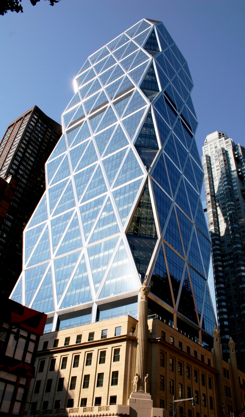 The Hearst Tower is a new skyscraper technically. It was built upon the existing Hearst Corporation headquarters. Only the Facade of the original building was kept and the glass skyscraper was added on top of it. I love the triangular design on the outside and the reflective quality the glass gives. Unlike most buildings that go straight up and down, the windows are angled, giving even more reflective quality from the street. The building was designed by Norman Foster and was the first 'green' building in New York. This surprises me since the building wasn't one hundred percent complete until 2006. What I like most about the facade of the building is the way Foster merged the original 1920s architecture with the modern skyscraper.
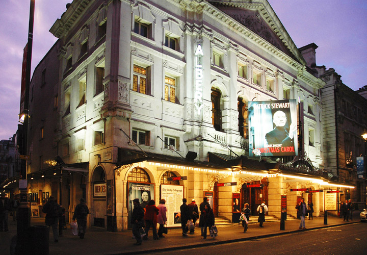 The Albery Theater in London reminds me of an era where men and women dressed up to go to the theater, when technology was hardly as advanced as it is now. This theater is classic and absolutely gorgeous at night with lights hanging from awnings. I particularly love the colors chosen such as the sandstone and how it contrasts with the red and black signs. The architecture reflects the time period but also references classical style architecture which makes a nice contrast between the two styles. The contrast is not extremely apparent and that is what makes this building so successful.
 This is a building where a lot of white works wonderfully. The Cy Twombly Gallery at the Menil Collection Museum in Houston, Texas was designed by Renzo Piano in 1995. I really respect Piano's work because he knows exactly what he's doing down to the placement of trees and plants such as in this photograph. The tree hanging down over the steps is absolutely gorgeous and contrasts wonderfully with the white of the building and the yellow light inside. Piano knew not to use stark white, even though this was a museum, he used grays and eggshells so the art work could stand out without the museum being stark white.
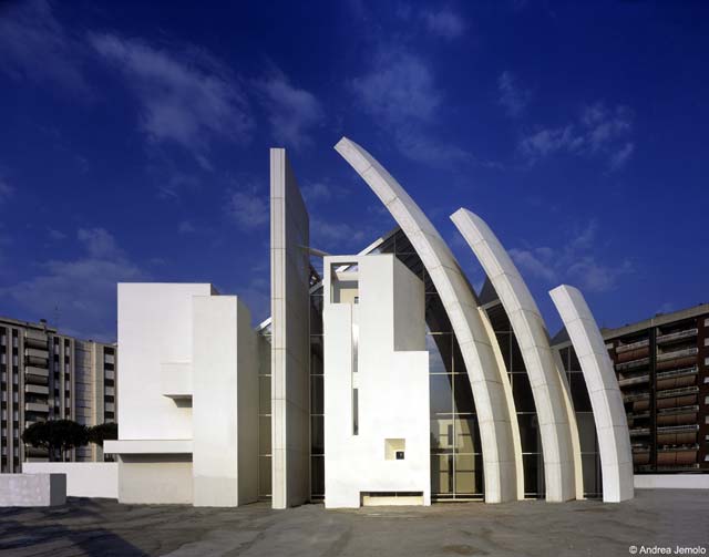


 The Farnsworth House by Mies van der Rohe is simple, modern, and beautiful. I love all of the angles used inside and out. The fact that the house is elevated so high off the ground makes it quite simple to access underneath the house, making it easier to do repairs and fix the framework. My favorite part about the house is actually not the house itself, but what surrounds it. The lush scenery surrounding the house looks like artwork from the inside. The crystal clear windows frame the outdoors beautifully. I really love so many things about this house but it is not livable in the aspect of it being placed into a neighborhood. This house is only comfortably livable if there are no neighbors considering the neighbors could see everything.
 The Centre Pompidou in France was designed by Richard Rogers and Renzo Piano. Construction began on the multi-purpose center in 1971 and was completed in 1977. The Centre Pompidou houses a large public library, the National Museum of Modern Art, and a center for music and acoustic research known as IRCAM. The center was made for social interaction. Pipes and all the inside workings of buildings are placed on the outside, making the building like a skeleton. People are able to see how everything works and how things are connected, which is a really interesting part of the architecture. The building becomes a learning experience in itself because of all the pipes and elements that are exposed. The bright colors and industrial pipes were probably very strange in the 1970s, but now they are quite modern and beautiful. I really love the colors used and this building seems like it would be so much fun to visit.


 Joanna Newsom's music is a beautiful mix of folk/experimental melodies. She plays the harp and her music is really soothing and I have some of her songs on my sleep mix on my ipod. This is why I love this illustration of her playing the harp and putting someone happily to sleep. This illustration is really cute and I like how the polka dots are out of order and randomly placed. I also like how the illustration is not colored in and it is just black and white so we can see the background behind it. The blog where I found this said that "Joanna Newsom is music for English majors. Newsom's are not so much songs but stories—sprawling pages of verse peppered with clever rhyme schemes." I love that statement and I guess that is why I love her music so much, If in some way design was not my favorite thing in the world, I would be an English major. I love poetry and her music is quite poetic.
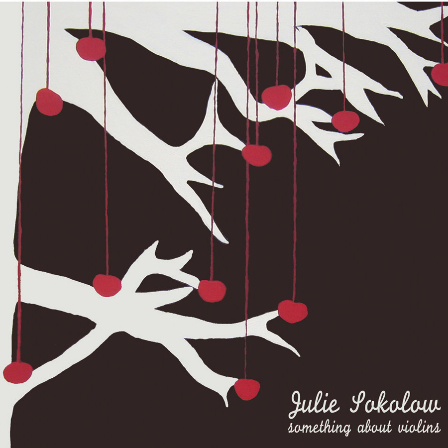
 This poster reminds me of the Julie Sokolow album art because of the tree and the hearts on strings. I actually saw this poster for Ted Leo back in high school and was inspired by it. I turned it into an art project and used the same idea with the hearts on the trees. Unfortunately I didn't understand the importance of documenting your work and so I don't have a picture of it. I really don't like the colors in this poster. It seems to me that the hearts and the tree are very 'girly' and 'girly' colors would have been more effective, but then again I understand that they are trying to advertise a band. Band posters can be very strange sometimes but I think the art is so interesting and different.
 Wilco is a great indie rock band with influence in alternative country. Alternative country, as in the kind you don't see on CMT. I like this band poster because the lime green really pops against the white background. The people in all different positions and outfits are really interesting and fun to look at. I think the black and white people was a very good choice because the focus should be on the band name and the the artwork as much.
 I actually have never heard of any bands on this flyer but I picked it up as soon as I saw it because of the colorful and interesting artwork. This is a flyer for an art show and music at The Green Bean in downtown Greensboro, probably my favorite coffee shop ever. I would just like to say that they truly make the BEST coffee I've ever had. It's a great place to just hang out and do homework as well. Back on topic, I don't understand what deer and hearts have to do with this show but frankly, it doesn't matter. It's a nice composition even if the artwork is a little disturbing with the heart. I really like the bright color combination, it really caught my eye.
 I haven't listened to this particular album by Band of Horses, but I have listened to some of their lasted albums and they are really good. Listen to "The Great Salt Lake" by them, I play it on almost every radio show I do. I really like this album cover because it reminds me of my childhood, yelling at the planes in the sky as they passed, and waving. Band of Horses has branded their name in a way. They have made all of their merchandise and album covers have the same font for their band name. I think that is a really effective strategy because it familiarizes the customer with their name. I also like how the tree and the person are black silhouettes against the bright blue green sky.
 I love Polaroids and this picture makes me want to draw a Polaroid camera now. The colors aren't too bright but they are still fun and the big stripes are really aesthetically pleasing. My favorite part about this poster is the actual Polaroid picture with the three artists. The Silhouettes are done really nicely and the black contrasts nicely with all of the colors. I haven't heard many songs by Peter Bjorn but what I have heard I really like.
 Blonde Redhead has a lot of different influences in their music. Some of their music is psychedelic, some is more towards the folk end, and some songs are more indie rock. When making album art or band posters I think it's really important to represent the band and their personal style of music in the artwork. I think this poster might be a little childish in the design but represented Blonde Redhead in a nice light with the colors used. Blonde Redhead is not all butterflies and stars and I think that this poster makes them look less serious. I love the colors used and the psychedelic patterns on the butterfly.
 Tegan and Sara recently got onto MTV and I am somewhat sad about that because their music is so amazing and I don't think Fergie and Akon deserve to be placed next to such talented artists. I think that The Con, Tegan and Sara's newest album is their best yet and the album cover doesn't really do it justice. I don't really understand the album art because the picture on the front you can't identify and the writing behind it you cannot read. But it looks like a journal, a secret, something you have to examine really well to understand. I do like the secretive element to the cover. Listen to all of the songs on this album but make sure you listen to "Call It Off."


