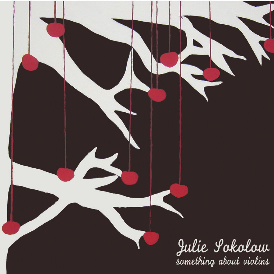
Julie Sokolow is a indie/folk artist with a beautiful and calming voice. Her music makes me just want to drive around and contemplate life. I really like this album design is because it gets your attention. It's not too complex, complex album art can be nice sometimes but most people really are interested in the music. Simple yet appealing album art is the most effective in my mind. If I went into a record store I would definitely pick up this album just because of the album art. I love the idea of cherries on strings hanging from a tree. It's not something you see in real life and the colors are what are really interesting. The spots of red get your attention while the white brings it all together. Also, the font is perfect because it seems to represent her personality and music. Her music is feminine, not always serious, and sometimes sad and I see that in the font and album art. Listen to the song "seasons" off of this album, it's amazing.
 Joanna Newsom's music is a beautiful mix of folk/experimental melodies. She plays the harp and her music is really soothing and I have some of her songs on my sleep mix on my ipod. This is why I love this illustration of her playing the harp and putting someone happily to sleep. This illustration is really cute and I like how the polka dots are out of order and randomly placed. I also like how the illustration is not colored in and it is just black and white so we can see the background behind it. The blog where I found this said that "Joanna Newsom is music for English majors. Newsom's are not so much songs but stories—sprawling pages of verse peppered with clever rhyme schemes." I love that statement and I guess that is why I love her music so much, If in some way design was not my favorite thing in the world, I would be an English major. I love poetry and her music is quite poetic.
 This poster reminds me of the Julie Sokolow album art because of the tree and the hearts on strings. I actually saw this poster for Ted Leo back in high school and was inspired by it. I turned it into an art project and used the same idea with the hearts on the trees. Unfortunately I didn't understand the importance of documenting your work and so I don't have a picture of it. I really don't like the colors in this poster. It seems to me that the hearts and the tree are very 'girly' and 'girly' colors would have been more effective, but then again I understand that they are trying to advertise a band. Band posters can be very strange sometimes but I think the art is so interesting and different.
 Wilco is a great indie rock band with influence in alternative country. Alternative country, as in the kind you don't see on CMT. I like this band poster because the lime green really pops against the white background. The people in all different positions and outfits are really interesting and fun to look at. I think the black and white people was a very good choice because the focus should be on the band name and the the artwork as much.
 I actually have never heard of any bands on this flyer but I picked it up as soon as I saw it because of the colorful and interesting artwork. This is a flyer for an art show and music at The Green Bean in downtown Greensboro, probably my favorite coffee shop ever. I would just like to say that they truly make the BEST coffee I've ever had. It's a great place to just hang out and do homework as well. Back on topic, I don't understand what deer and hearts have to do with this show but frankly, it doesn't matter. It's a nice composition even if the artwork is a little disturbing with the heart. I really like the bright color combination, it really caught my eye.
 I haven't listened to this particular album by Band of Horses, but I have listened to some of their lasted albums and they are really good. Listen to "The Great Salt Lake" by them, I play it on almost every radio show I do. I really like this album cover because it reminds me of my childhood, yelling at the planes in the sky as they passed, and waving. Band of Horses has branded their name in a way. They have made all of their merchandise and album covers have the same font for their band name. I think that is a really effective strategy because it familiarizes the customer with their name. I also like how the tree and the person are black silhouettes against the bright blue green sky.
 I love Polaroids and this picture makes me want to draw a Polaroid camera now. The colors aren't too bright but they are still fun and the big stripes are really aesthetically pleasing. My favorite part about this poster is the actual Polaroid picture with the three artists. The Silhouettes are done really nicely and the black contrasts nicely with all of the colors. I haven't heard many songs by Peter Bjorn but what I have heard I really like.
 Blonde Redhead has a lot of different influences in their music. Some of their music is psychedelic, some is more towards the folk end, and some songs are more indie rock. When making album art or band posters I think it's really important to represent the band and their personal style of music in the artwork. I think this poster might be a little childish in the design but represented Blonde Redhead in a nice light with the colors used. Blonde Redhead is not all butterflies and stars and I think that this poster makes them look less serious. I love the colors used and the psychedelic patterns on the butterfly.
Finally a poster that captures the essence of the artist. Cat Power is a devistatingly beautiful woman who hides behind her hair and is one of the most insecure and quiet singer/songwriters ever. She makes very pretty, sad, and slow music and she often reminds me of a shy little girl with pressure constantly coming down on her (hence the arrow coming down on her head.)
 Tegan and Sara recently got onto MTV and I am somewhat sad about that because their music is so amazing and I don't think Fergie and Akon deserve to be placed next to such talented artists. I think that The Con, Tegan and Sara's newest album is their best yet and the album cover doesn't really do it justice. I don't really understand the album art because the picture on the front you can't identify and the writing behind it you cannot read. But it looks like a journal, a secret, something you have to examine really well to understand. I do like the secretive element to the cover. Listen to all of the songs on this album but make sure you listen to "Call It Off."
No comments:
Post a Comment