

The Villa Savoye by Le Corbusier and Pierre Jeaneret was built in 1929 and is one of my favorite buildings of the 20th century. The long horizontal window brings visual interest to the facade of the building. The windows are so crystal clear from the inside and provide a cohesive element to the house. As much as I enjoy the facade, it's the inside of The Villa Savoye that I enjoy the most. The long line of the silver pipe in the ceiling mimics the the long horizontal elements that are repeated throughout the home from the window to the columns. The pop of color against the white and the simplicity of the furniture works really well and is just right because the inside and outside of a building should be cohesive on a certain level.
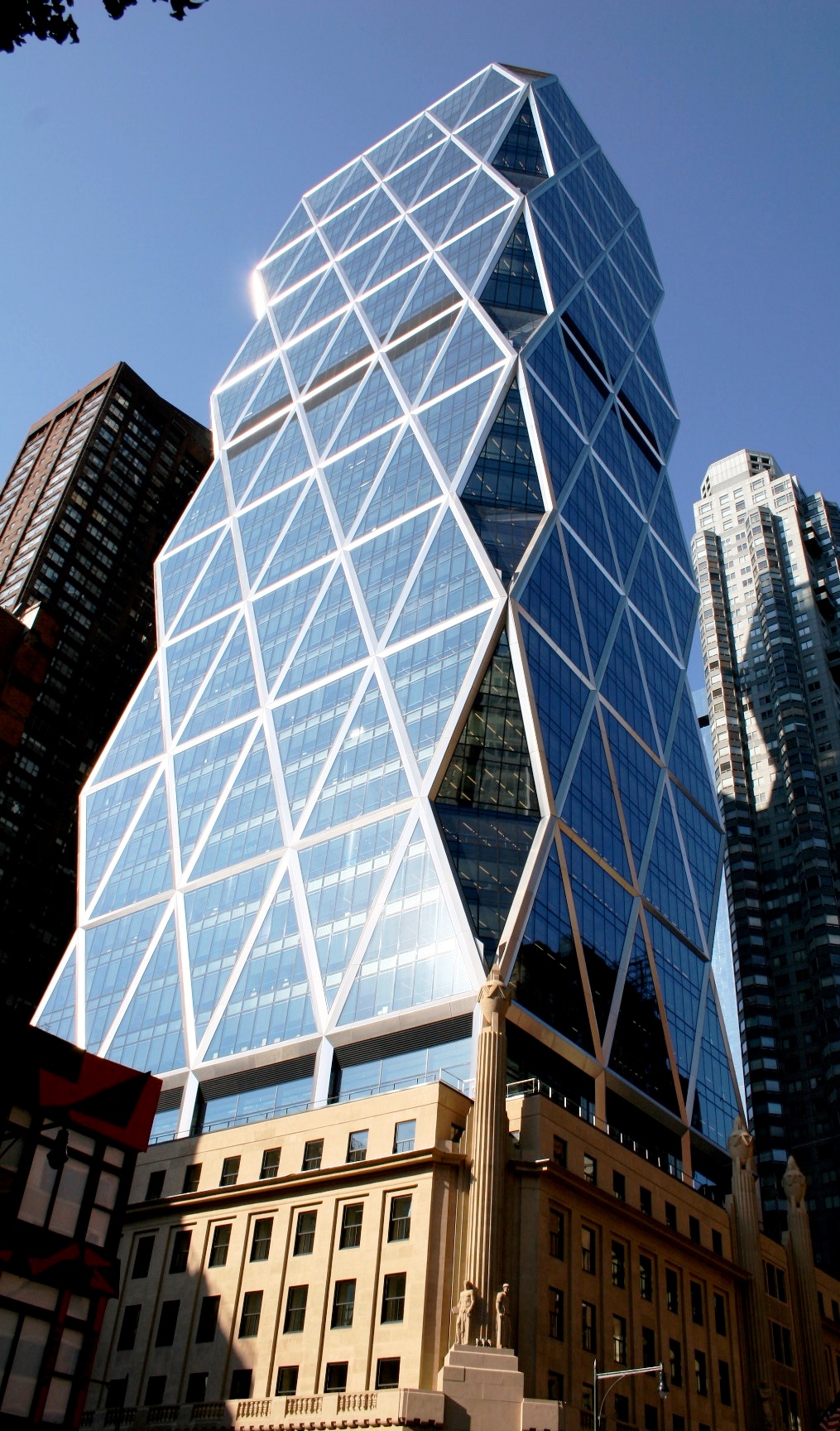 The Hearst Tower is a new skyscraper technically. It was built upon the existing Hearst Corporation headquarters. Only the Facade of the original building was kept and the glass skyscraper was added on top of it. I love the triangular design on the outside and the reflective quality the glass gives. Unlike most buildings that go straight up and down, the windows are angled, giving even more reflective quality from the street. The building was designed by Norman Foster and was the first 'green' building in New York. This surprises me since the building wasn't one hundred percent complete until 2006. What I like most about the facade of the building is the way Foster merged the original 1920s architecture with the modern skyscraper.
The Palace Hotel in St. Moritz Switzerland was opened in 1896 by Caspar Badrutt. The Palace hotel is a luxury hotel in the beautiful mountains of Switzerland. Red balconies, and beautiful stone contrast with the dark green roof. The best part is the views of the snow capped mountains. Alfred Hitchcock and Greta Garbo were known to stay at this fairytale hotel. When I think of buildings in Switzerland I think of buildings such as this with wooden framework, stone, and Christmas colors. Although this hotel is somewhat stereotypical of buildings in The Alps, it is still beautiful and I'm sure quite lovely to stay at.
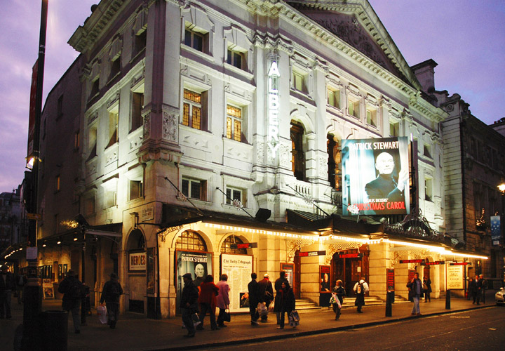 The Albery Theater in London reminds me of an era where men and women dressed up to go to the theater, when technology was hardly as advanced as it is now. This theater is classic and absolutely gorgeous at night with lights hanging from awnings. I particularly love the colors chosen such as the sandstone and how it contrasts with the red and black signs. The architecture reflects the time period but also references classical style architecture which makes a nice contrast between the two styles. The contrast is not extremely apparent and that is what makes this building so successful.
 This is a building where a lot of white works wonderfully. The Cy Twombly Gallery at the Menil Collection Museum in Houston, Texas was designed by Renzo Piano in 1995. I really respect Piano's work because he knows exactly what he's doing down to the placement of trees and plants such as in this photograph. The tree hanging down over the steps is absolutely gorgeous and contrasts wonderfully with the white of the building and the yellow light inside. Piano knew not to use stark white, even though this was a museum, he used grays and eggshells so the art work could stand out without the museum being stark white.
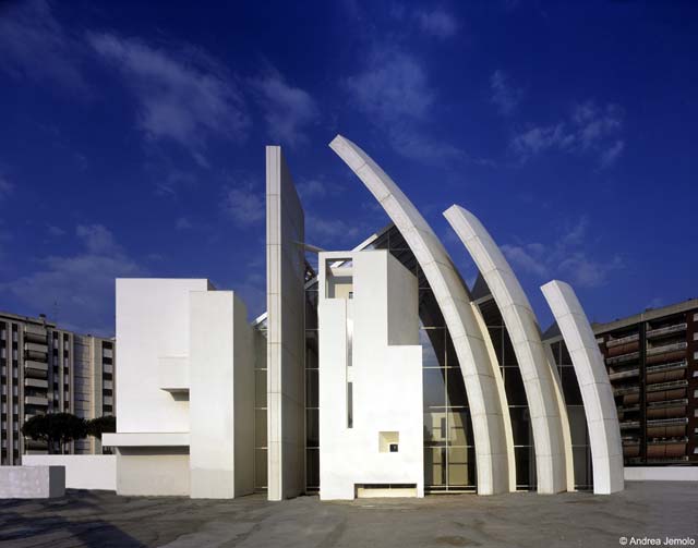
The Jubilee Church designed by Richard Meier scares me. I really dislike this building on many different levels. To begin with, the building is too white, so white that It's uncomfortable. I understand that Meier and his associates were going for the look of 'heaven' but to me the white makes me want to stay away from it because it is such as sharp white. Secondly I really dislike the structure of the building, especially the three pillar like structures aiming towards the heavens. I feel like a church shouldn't have such sharp and abrasive lines, that it should comfort and shelter the people inside of it. Churches are a place for reflection and prayer, I don't think I would feel very reflective in a place like this. The last thing that deeply disturbs me is the symbolism in the building. Arcspace.com explains how Meier and his associates designed the building to represent faith beliefs. "The proportional structure of the entire complex is based on a series of squares and four circles. Three circles of equal radius generate the profiles of the three concrete shells that, together with the spine-wall, make up the body of the nave. The three shells imply the Holy Trinity, while the reflecting pool symbolizes the role played by water in the Baptism ritual."


 The Farnsworth House by Mies van der Rohe is simple, modern, and beautiful. I love all of the angles used inside and out. The fact that the house is elevated so high off the ground makes it quite simple to access underneath the house, making it easier to do repairs and fix the framework. My favorite part about the house is actually not the house itself, but what surrounds it. The lush scenery surrounding the house looks like artwork from the inside. The crystal clear windows frame the outdoors beautifully. I really love so many things about this house but it is not livable in the aspect of it being placed into a neighborhood. This house is only comfortably livable if there are no neighbors considering the neighbors could see everything.
 The Centre Pompidou in France was designed by Richard Rogers and Renzo Piano. Construction began on the multi-purpose center in 1971 and was completed in 1977. The Centre Pompidou houses a large public library, the National Museum of Modern Art, and a center for music and acoustic research known as IRCAM. The center was made for social interaction. Pipes and all the inside workings of buildings are placed on the outside, making the building like a skeleton. People are able to see how everything works and how things are connected, which is a really interesting part of the architecture. The building becomes a learning experience in itself because of all the pipes and elements that are exposed. The bright colors and industrial pipes were probably very strange in the 1970s, but now they are quite modern and beautiful. I really love the colors used and this building seems like it would be so much fun to visit.

Art Deco Buildings are so interesting to me and the Chrysler Building particulary intriques me because of it's repeated sharp triangles which point upwards in a fashion that makes the building look even larger. For a moment in time the Chrysler Building was the tallest building in the world. That is an impressive fact but height isn't everything, and I am glad that the architect, William Van Alen, didn't sacrifice architectural beauty for height. The Chrysler Building is a masterpiece of the Art Deco period and was built surprisingly fast in 1929. With a competition to build the worlds tallest building in the quickest amount of time, William Van Alen succeeded in much more than the competition.


Casa Mila is considered a great landmark in Barcelona. The apartments were built in the early 1900's. I'm not exactly sure what the building is used for today, it seems like it would be a landmark and museum by itself. Architectural details are everywhere in this building. Living in one of these apartments would be like coming home to a Some find Casa Mila by Antoni Gaudi too free-form and much like a bee-hive or castle in an aquarium. Personally, I love the curves and nooks in the balconies of this art nouveaufairytale everyday. If I every get a chance to go to Spain, this is the first place I will visit.
1 comment:
wow! impressive . i,m first year student of architecture... and now iknow i did nothing this year !!! what a shame
Post a Comment